The 2020 Ecommerce Product Photography Guide to Storytelling Success
Ecommerce product photography can make or break your sales. Pattern's expert creative team serves up product image best practices for storytelling in 2020.
It’s easy for anyone to put up one or two crappy images that display their product on Amazon or other marketplaces. So what really makes your product images and photography stand out from the rest? After all, ecommerce product photography can make or break your product listings when it comes to conversion, branding, and even customer satisfaction.
The secret to successful product photography that converts is actually quite simple, and all boils down to getting one thing right: Storytelling.
Pattern’s product photography experts are among the few in the ecommerce world today who understand that the difference between adequate and excellent listings is curating a brand story. Of course, a successful brand story not only translates your brand image, but also gives information to the consumer in a way that encourages them to make an informed purchase.
Let’s dive into why storytelling for ecommerce product photography is so important, some best practices that’ll help you stand out from the rest, and then take a look at a few case studies that’ll put our money where our mouth is, so to speak.
Why storytelling is important for product photography
Picture this: You’re browsing for a product on Amazon. What catches your eye first? Is it the title? The shipping date? The price? All that’s important once your interested is piqued, of course, but before anything else, it’s most likely the product image that caught your attention. According to Vouchercloud, 93% of consumers say visuals are the top factor affecting their ecommerce purchase decision.
Whether consciously or not, your brain automatically runs through a checklist similar to this:
- Does the product seem like what I'm looking for?
- Does it look durable, nice, tasty, beautiful, or X characteristic that I need right now?
- Do I trust that the product will be what I need?
You can tell all of these things and more in the milliseconds it takes you to glance down the first page of search result images. For sellers, having product photography that resonates with consumers is the small-but-extremely-important difference between a scroll and a click.
There are two overarching reasons why you absolutely must get product photography right by incorporating storytelling:
1. Show don’t tell. Showing (and not just telling) a story with a product photography first and foremost gives you a chance to visually explain what a product is like before a consumer ever gets into the specifications outlined in the product description’s bullet points. You can easily call out things that customers care about (like size, form, and style) without a single word. Talk about effective!
2. Build trust. Consumers can tell if you’ve put effort into your initial product photography. If your initial image gives a good impression that you’re trustworthy, that your product is what they need, and that it’s better than your competition, you’re already far ahead of other sellers who could care less about their images. (Because what story does that tell the consumer?)
Best practices for product photography storytelling
So what can be done? How does one tell a story through product photography? According to Scott Davis, Pattern’s Director of Photography, it’s a fine mixture of technical know-how, experience, and strategic decision making.
Scott suggested these 5 best practices for ecommerce product photography that brands should start implementing to really start seeing results.
1. Make sure product photography gives context.
Scale, style, and use are important things to convey in an ecommerce product listing image. At its core, the idea is to make the online shopping experience as similar to a real life shopping experience as you can.
Ways to give context through product photography:
- Make sure your images and clear, sharp, and well lit.
- Show the product in use in a lifestyle image. This will help consumers understand how the product can be used, and also give them an idea of how the product occupies space.
- Show the product in action. If it’s a container, show it filled with something. If it’s a clothing item, show how it fits when worn.
More and more consumers are relying solely on online marketplaces to buy things they would normally find in physical stores. Ergo, brands who give consumers a more complete online shopping experience are bound to rise above the rest.
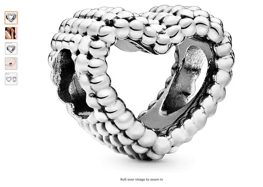
Take our brand partner Pandora. With charms and jewelry, it's extremely difficult to understand size and fit unless you show it. (Telling customers it weighs 1.3 grams and is 11.3 x 8 millimeters wide isn't going to do much.)
Look at these two examples of images on a product listing. Which one are you more inclined to buy?
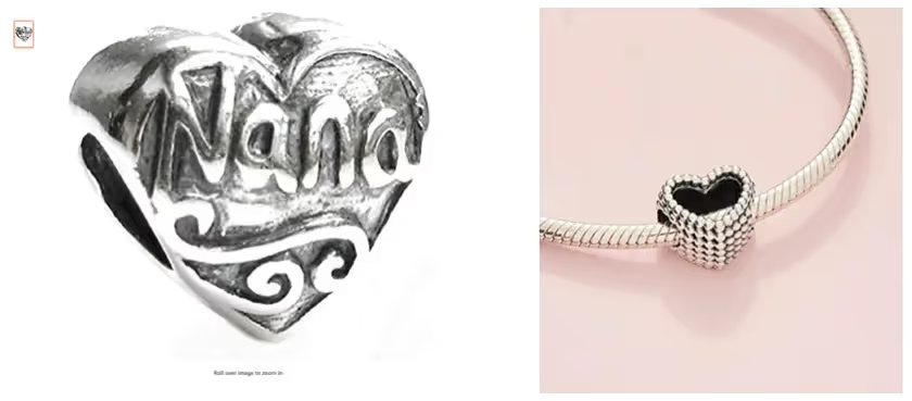
Probably the one on the right, right? It shows you how the charm fits on a bracelet, and also gives an idea of the item's functionality.
2. Take time to fully understand your brand story.
Do you have an in-house creative team? If you’re one of the lucky few that do, are they making decisions to consciously tell your story on Amazon and other marketplaces in a way that'll increase conversion?
It’s important that your creative team takes enough time to fully understand your brand and your story, inside and out. Unfortunately, many brands turn to creative agencies to deliver product images or mockups for product listings who could care less about digging into a brand story. The disadvantage there is that many agencies just want to get a job done—they’re not looking for long-term growth or watching out for brand equity.
At Pattern, Scott explained that one of our greatest advantages is that we operate almost just like an internal creative team with our partners. Since we’re actually invested in the product’s success because we purchase it up front, we’re not just selling a service.
“An agency or another service provider can easily take photos of your products for you,” Scott said. “But Pattern can help recommend the types of images that are going to help your product sell better. There's a difference between doing what you're asked and being a partner and understanding your brand enough to help do the right thing for your brand.”
3. Be strategic.
You need a creative team who can make strategic decisions on your behalf with sales in mind—otherwise you might end up wasting a lot of valuable time and resources on things that (at the end of the day) don't convert into more sales.
Some basic strategic practices include:
- Take inventory of the types of content you’re displaying and its usefulness to you. Do you have computer generated renders of your products? Should you? Are you using spins? Videos? Do you even need them?
- Then take inventory of what types of content you should or could display that would help your product sell better. Would a 360 spin image help your customer get a better idea of your product? What about a video?
Remember, the goal here isn’t to be willy-nilly about including any and every type of content that you can, but to decide strategically what product lines and which specific ASINs could benefit from some extra love.
4. Utilize content offerings on different marketplaces.
We’ve hit on product photography and images so far, but those aren’t the only ways you can tell a brand story on Amazon or other marketplace product listings.
- Use A+ Content
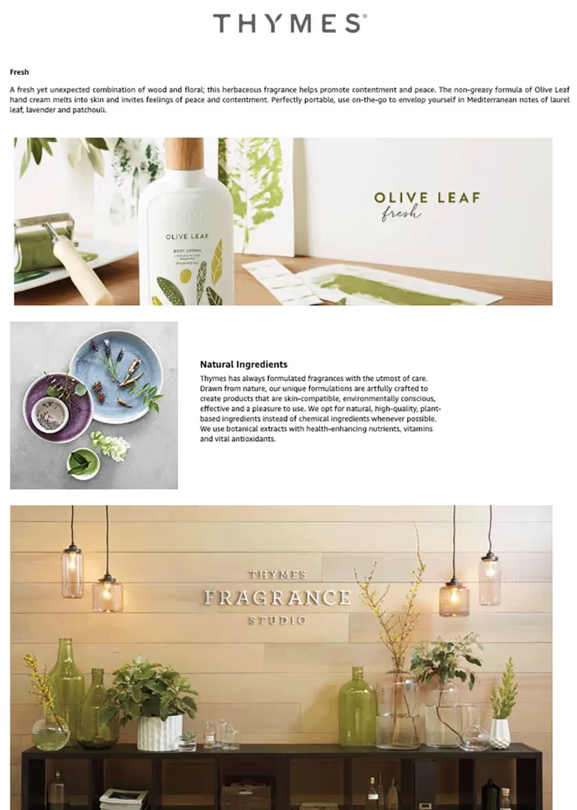
Options like A+ Content (formerly Enhanced Brand Content for Vendors) can really help your brand shine on Amazon. Even eBay, Walmart.com, and Google Shopping offer sellers options for customizing their product content and listings.
Check out this example for A+ Content from our brand partner Thymes. Learn more about incorporating A+ Content on your listing.
- Use image slots correctly.
Of course, then there's the basic things like having one or two different images on a given listing. Amazon gives you up to 9 product image slots on a given product listing. While they usually only display 7 at a time, more are available if consumers click into your listing. You'll want to make the first main image a simple photograph with no graphic text. You want the image to stand out, but not at the expense of the product.
If you can clearly tell your product story in 4 or 5 images (which Scott recommends as a minimum image count), don’t waste your energy on pumping out more images just for the sake of it. As Scott said, there may not be a benefit to going above 6 or 7 images, but there is a clear disadvantage if you’re only giving 1 or 2 images.
5. Don't forget to get the technical elements right.
Finally, if you're going to make the effort to tell your brand story on a product listing, at least make sure you get the basic requirements for photo size and color down. You can go through all of Amazon's product image technical requirements here. In addition to the minimum requirements, we recommend you do the following:
- Size: Amazon requires images of at least 1000 pixels or larger in either height or width, but those hardly show up well when a customer is zooming in or examining a product more closely. Scott recommends using at least a 2560 x 2560 pixel image (note that there’s a 10,000 x 10,000 pixel limit). As 4K and 5K monitors become more and more common, it's important to have larger images to make sure your product photography and imagery on a product listing can look great even on the largest monitor.
- Color: Although Amazon says images in either sRGB or CMYK are acceptable, the reality is that Amazon will end up converting your image to sRGB anyway. Take the effort to convert your images to sRGB first to ensure the best color experience for your customers. After all, if you do something that makes your colors look bad on your end, chances are it'll only get worse on a consumer's end of things.
Pattern product photography case studies
We’re proud of the creative work we do for our partners, and we’re committed to going above and beyond expectations to make sure we tell their brand story right on the marketplace. Here are examples of our favorite product imagery and photography that we’ve done for our brand partners.
Pure Encapsulations
As a premium vitamin and supplement brand, we made sure Pure's Amazon listing looks and feels just as excellent as their product. After using our images and Enhanced Brand Content for a month, Pure’s increased units sold by 325.7%.
Notice that we have 7 different product images and video for customers to go through here. The main image is basic, clean, and crisp—it is even able to highlight small physical details like the raised name around the bottle.
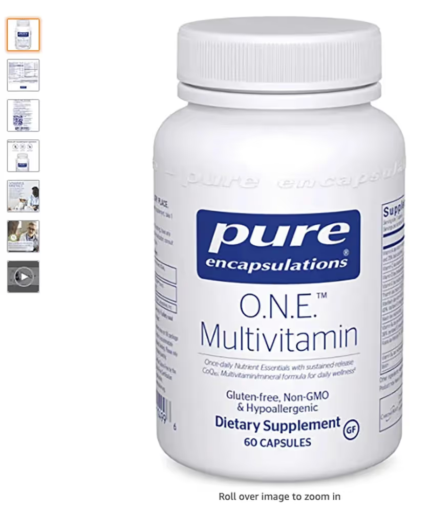
Next, we have great supplemental (pun intended) images of the product, including the pills, as well as lifestyle imagery that tells Pure's story in a unique and effective way.

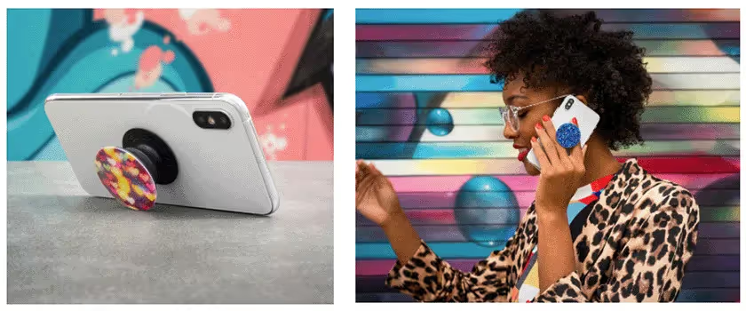
Popsockets uses 3D renders of their product. However, for an item like Popsockets, it’s important to give context about what the product does.
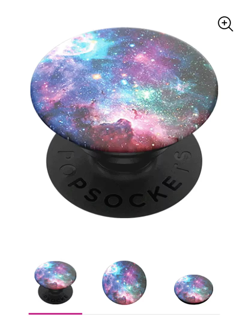
For example, the first simple render of a Popsocket doesn't tell us anything about the size and use of a Popsocket. However, once you show the Popsocket in use (as in the images below), the whole narrative changes.
For this jewelry brand, scale and contextual images are extremely important because of the size of their product, as we mentioned earlier. Our creative team added lifestyle contextual images to their product image list to give consumers a better feeling of each product's use and style.
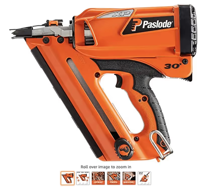
Adding lifestyle photography helped Paslode give consumers a good sense of how a Paslode nailer could be used. We helped Paslode develop out their product images in a way that gave consumers a better idea of what the would feel like and look like in real life.
Contact us below to see how Pattern can vamp up your product photography (at no added cost to you!) through a Pattern partnership.
.jpg)


