Amazon Storefronts That Will Give You Serious Marketplace Envy
A great Amazon storefront makes all the difference. Pattern's Amazon experts compiled a list of our favorite Amazon storefronts that look amazing.
Shopping can either be a delightful or nightmarish experience. From big department stores to boutique shops, lots of time and money is spent making sure customers feel comfortable so they spend money. And now that more than 70% of Americans are shopping online, the ecommerce world is taking note. Online marketplace giant, Amazon, makes it easy for brands to give their customers a visual and more immersive experience when they're browsing for products.
Creating a thoughtful design for your Amazon storefront helps set positive first impressions and communicate your brand’s feel, ultimately driving traffic and increasing conversations. So, if your Amazon storefront needs some remodeling, here are several storefronts that stand out above the rest.
1. Amazon Basics
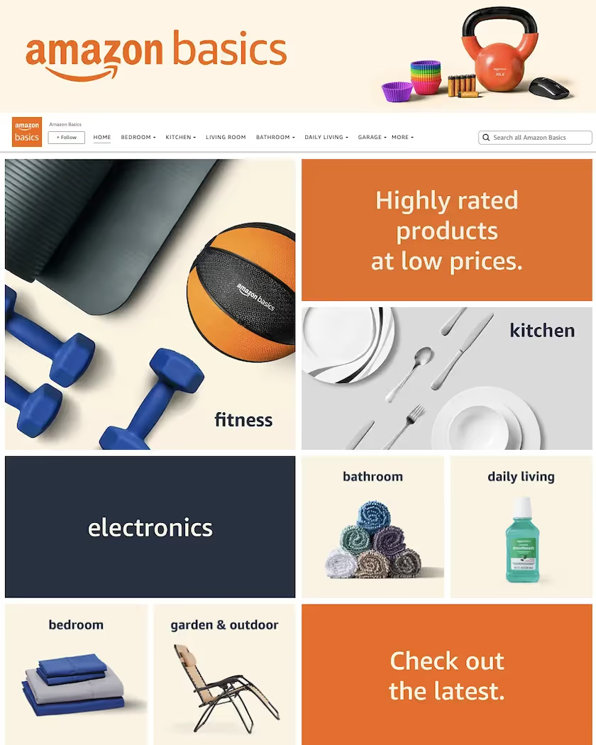
Amazon’s very own AmazonBasics storefront is a superb virtual store example. When you visit, you immediately get an overview of their wide variety of products and categories. The imagery is simple, clean, and straightforward–which reflects what resonates with shoppers, particularly those interested in AmazonBasics products.
2. Petcube
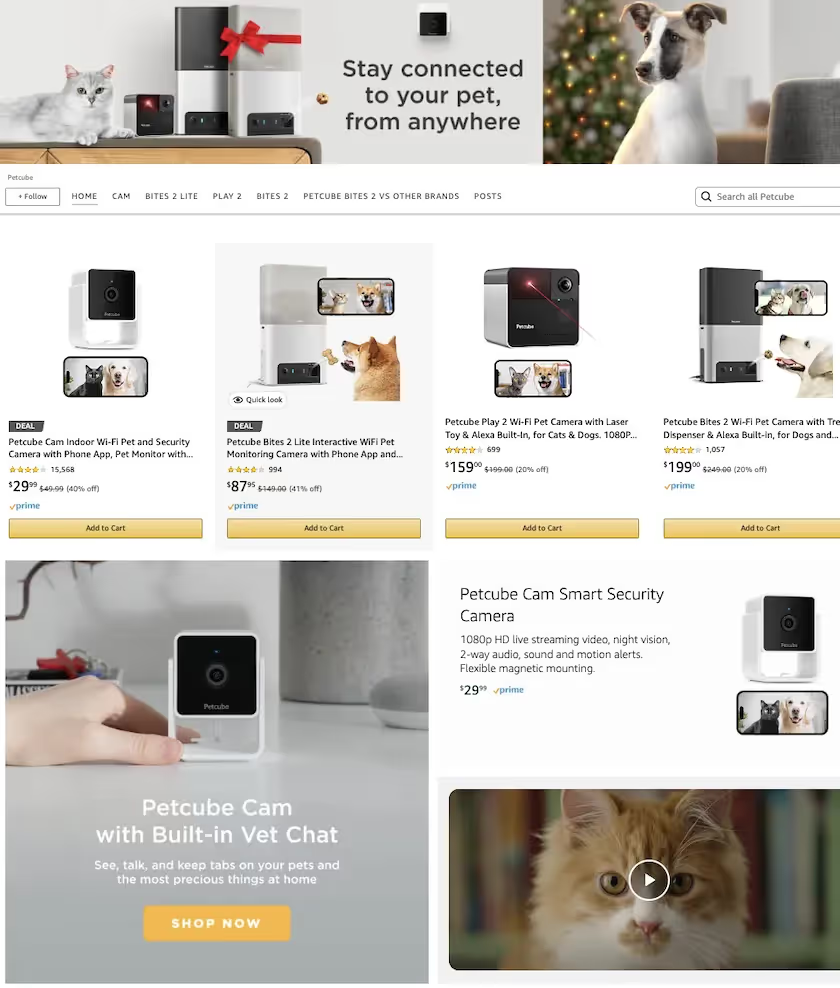
Petcube’s Amazon store is a stellar example of a brand understanding their target market. By using thoughtful design, shoppers get a clear demonstration of how Petcube products work. The balance between images and key features is spot-on, not to mention the abundance of cute dogs and cats. Petcube’s Amazon store is graphic and informative in the best possible way.
3. Thorne
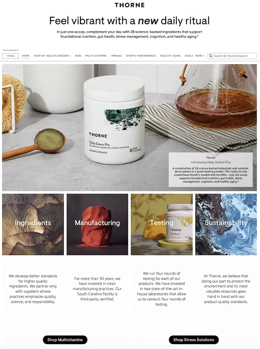
THORNE takes vitamin shopping to the next level. Although their design is different from the myriad other vitamin brands on Amazon, they stand out through product photography and sharing different rounds of product testing—helping shoppers feel informed and confident in their purchase.
4. Feetures
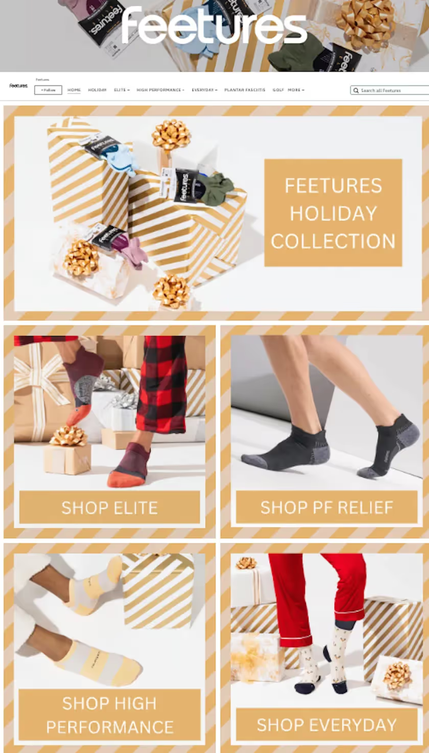
When it comes to marketing socks for runners and athletes, Feetures deserves a medal for their Amazon store. With extra detail put into updating their storefront, such as timely holiday-themed content, Feetures shows they are a dynamic and relevant brand. An energizing color scheme gives shoppers an immediate feel for the brand, in addition to a compact grid that shows off different sock designs and categories.
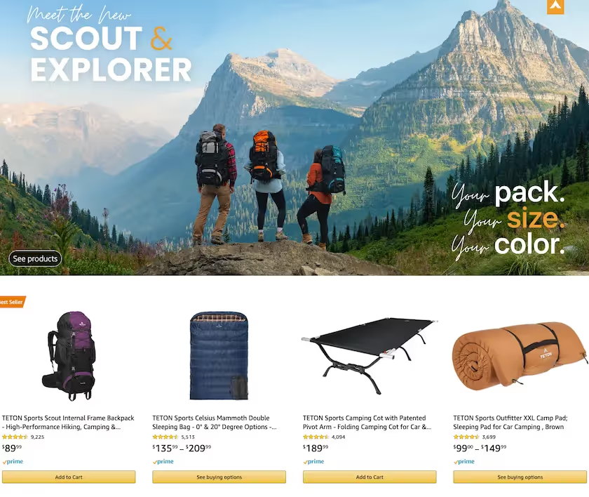
5. Teton Sports
Teton Sports sells a wide variety of outdoor products, and their stellar Amazon store layout inspires shoppers to continue to adventure and explore from the outdoors to their products. Throughout the page’s design, their products take center stage, are shown in natural use situations, and imagery shows campers using the brand in nature.
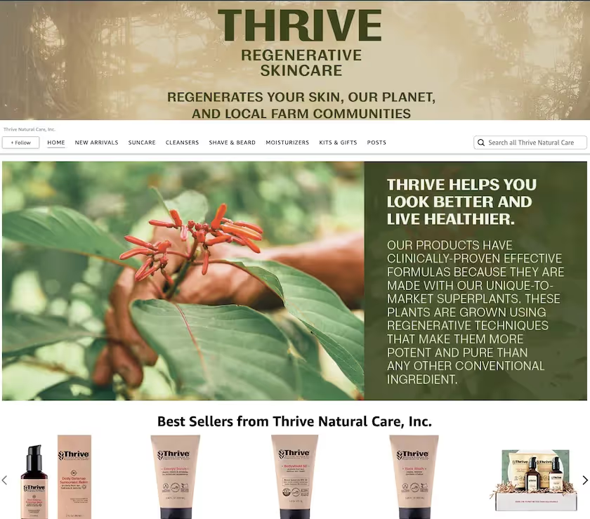
6. Thrive Natural Care
Thrive does an excellent job of grabbing the attention of potential customers with dramatic lifestyle images and a bold, earthy color palette. This Amazon store makes shopping for grooming essentials an easy and visual experience.
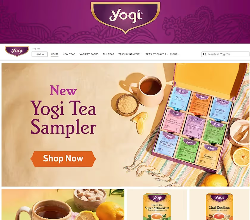
7. Yogi Tea
Few things are more comforting than a warm, aromatic cup of tea and Yogi’s Amazon store translates that feeling seamlessly on their virtual storefront. An excellent store banner is accompanied with cozy, seasonal imagery and intuitive product categories. Yogi’s execution of their Amazon store allows shoppers to experience their product with their eyes before even taking a sip.
Improve Your Amazon Storefront With Pattern
So there it is, a select few of the best-looking Amazon stores out there. Each has unique aspects that make it great, but one thing they all have in common is the potential for increased impressions, traffic, and conversions–all key measurements for a successful online marketplace presence, proven by Pattern’s ecommerce equation.
As an Amazon 3P partner, Pattern helps brands improve and optimize their Amazon presence by creating quality written and visual content. We take care of every aspect of your Amazon presence beyond the page as well, which spans from brand control to listing optimization and customer support. Looking to improve your Amazon page? Contact us.
.avif)



.jpeg)

