Australia - 10 ways to improve your popup and increase conversions
Discover how to use best practice to create the best popup signup form to increase form conversions and build your CRM database with Pattern AU.

A popup form is an effective CRM strategy that allows website visitors to join an email list by submitting their email or phone number. They are an essential way to generate leads and build a base of engaged subscribers. Popups in particular can be one of your best converting opt-in sources. A good popup should convert at least 1-3% of your visitors, but the best popups can convert up to 6.5% of your website visitors. In this article, we’re sharing 10 ways to build the most effective popup to get the best results for your ecommerce site.
1. Write a Short and Sweet Copy
Engaging copy makes all the difference in a popup. Your customer will only engage or respond when they see the value in your product - and you only have a few seconds of their time to delight them before they close the window. Make sure your copy is short, clear, and benefit-driven - being sure to use your brand’s voice and personality. Make sure to stay away from outdated words like ‘database’ and ‘newsletter’, and use copy to create a sense of community and exclusivity.
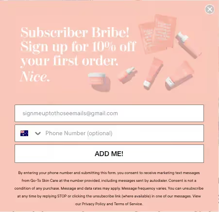
As an example, Go-to skincare uses their unique tone of voice to create playful, straight-to-the-point copy.
2. Use Clear and Compelling CTAs
The call to action on your popup is critical to conversions. Popups are a fleeting chance, so the customer needs to know instantly where to click, and feel compelled to do so. We would suggest designing with a contrasting color and using action-driven text in the first person. Get clever with your CTA language as well. What would your audience prefer to click on? A standard ‘Submit’ button, or perhaps a more friendly ‘Count me in’ or ‘Yes please!’
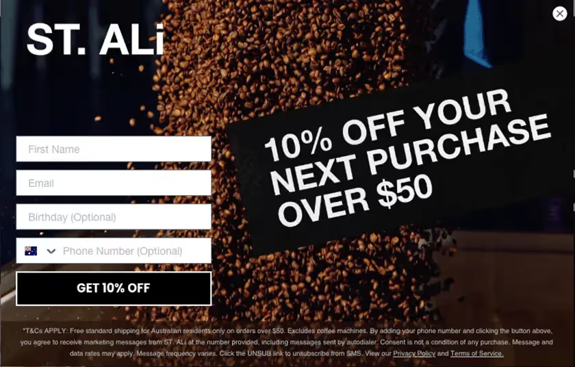
As seen above, St. Ali makes clicking on the CTA a no-brainer.
3. Give Your Popup Value
Customers are getting more data savvy, and unless actively engaged with your brand, will not be willing to exchange their personal information for no return. Depending on your product or offering, here are some ideas for what to offer a lead to join your database.
- % or $ off
- Gift with purchase
- Free shipping / Free express shipping
- Downloadable content (eg. a recipe book, style guide)
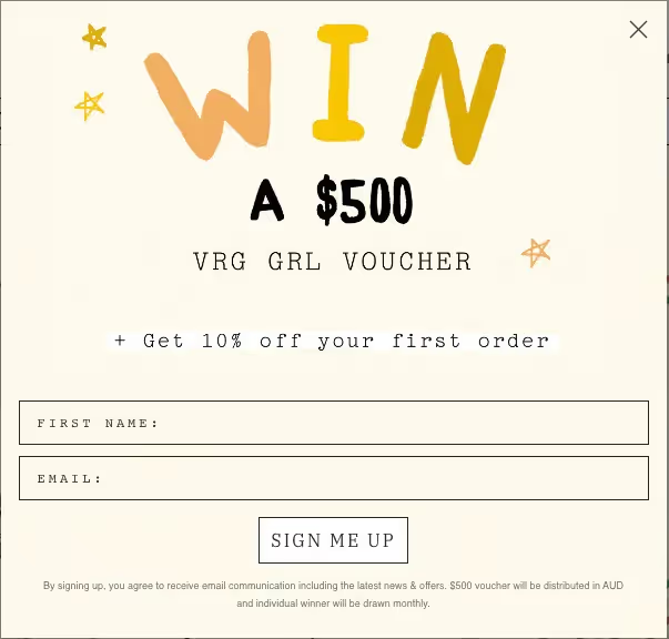
Here, VRG Girls gives the website visitor a deal they can’t turn down - a chance to win a $500 voucher and 10% off their first purchase. Double value = double the acquisition!
4. Request the Bare Minimum
More fields = more drop offs. Think of a form field as a hurdle for a potential customer. How many hurdles do you want them to jump over? Consider what you REALLY need to get a new contact into your database, and only request absolutely critical data fields in the popup.
- Is the first name field business critical for you? If not, consider dropping it from the popup. Remember, you can always collect zero-party data in the future through update your detail flows, or integrations with ERP or ecommerce platforms.
- Do you need to know the gender of your lead? If you’re selling a product like coffee or electronics, the answer is probably no, and you don’t need to collect it in your popup.
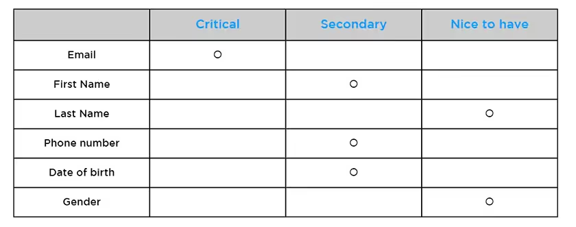
However, if you’re selling both menswear and womenswear, it is likely critical that you find out what gender your potential customer is so that you can market to them appropriately. In this case, you can class ‘gender’ as critical, and include it in your popup. Here’s an example of how you can map out what data fields you may need, and decide what to include in your popup.
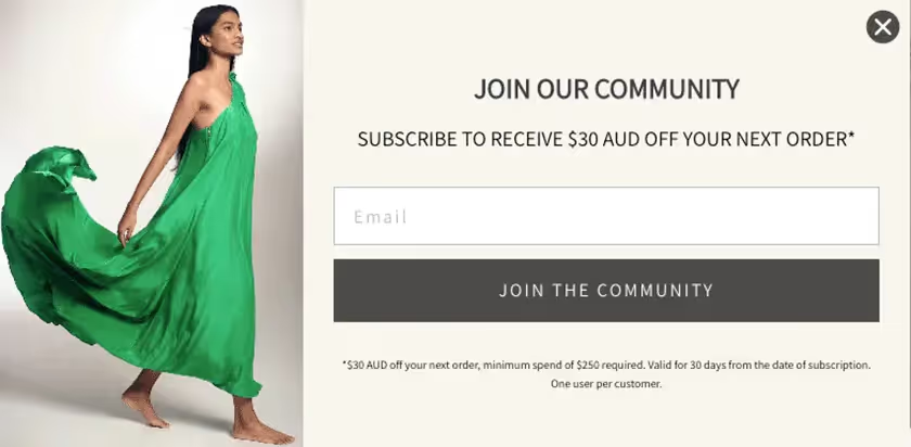
Ginger and Smart keeps it simple - asking for just your email address. This makes the barrier to entry very low and accessible.
5. If You Require Additional fields, Use a Multi-Step
If you need more than 1 or 2 fields, consider using a multi-step form instead. This breaks up the popup into two steps, so the form looks easy and digestible first. Put business critical fields on step one so they are captured and entered into your database, before showing step 2 with secondary fields. If visitors drop off at step two, at least you’ve already collected business critical information and inducted them into your database.
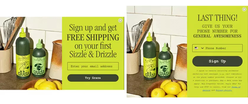
Graza uses a multistep form to collect email address first, and then phone number secondary. This approach means the popup looks easy to fill out from the customer’s point of view.
6. Optimise for Mobile
Chances are most of your website traffic comes from mobile, so it’s important that your popup looks great on mobile to capture this segment of visitors. Consider creating two bespoke popups, one for desktop and one for mobile, and adjust proportions, placement, and creative. Consider making the closing button for the popup slightly larger and more visible in the mobile version. This is to account for clumsy fingers and a smaller screen.
7. Use Targeting Behavior
Consider this scenario. A customer who has purchased from your website twice before and has been subscribed for over a year to your database navigates to your home page, and is served a popup form. “Sign up now to receive 10% off your first order and an exclusive gift.” This could be a totally different offer to what they signed up for 1 year ago, and they have not received this gift with purchase before. They could easily feel their loyalty to your brand is not rewarded compared to new customers, and this will leave a bad taste in their mouths about your brand. This is why it’s important to use targeting behavior rules for your popups. Only serve first purchase offer to visitors who have not purchased from you before, or are not part of your database. What about repeat purchase visitors, whose email you already have? Consider what data fields you need from this segment, and target with popups asking for different information - eg. date of birth or mobile number.
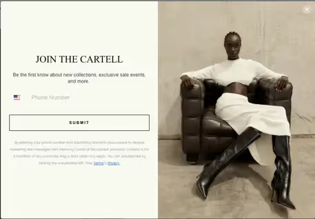
MANNING CARTELL specifically targets existing contacts who have submitted their email but not their phone number with this popup.
8. Allow Users To Close Your Popup Easily
Signing up for your CRM database should be an option, not a requirement. If a visitor doesn't want to give you their email address, you need to respect that decision. Allow visitors to easily close the popup. They might need more time on your site before they trust you enough to exchange their data. If you purposely make it difficult for a customer to close a popup, they will not only see it as bad CX but also as sneaky behavior from your brand. This will hurt your conversion rate and you might have a visitor bounce or even worse, close the web browser page altogether!
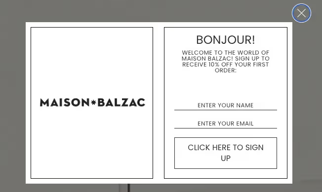
Here, Maison Balzac does not try to hide the close button on their popup - allowing the customer to feel like it is totally their choice if they sign up or not.
9. A/B Test
Unsure of anything? AB test it! Here are some suggestions of what you can AB test to help find your ultimate popup form for your specific audience.
- Creative
- CTAs
- Timing of when the popup is displayed
- Copy
- Offer
10. Create a Success Page
Imagine if you were giving your email address and name to a concierge at a hotel. Once you finish spelling it out - they disappear. Weird right? That’s how it feels when a customer clicks submit in your form and it simply closes. Did it work? What happened to their data? What do they do now? Make sure to complete the customer experience by displaying a success page after submission, with a ‘thank you’ and instructions on what to do next. E.g, Check your email for the discount code.
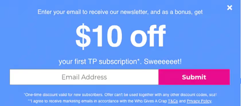
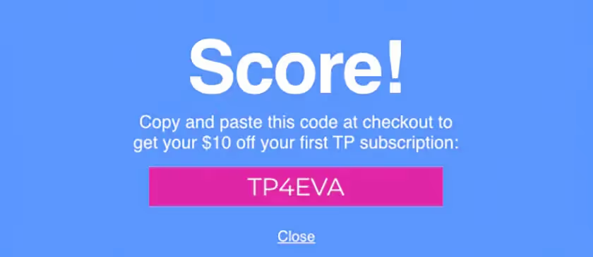
A great example of a popup that ticks all the boxes is Who Gives a Crap! Offers value, keeps it simple, and has a success page after submission. The use of successful popups is one of many strategies to employ in your own CRM strategy. To find out more about how Pattern Australia can support the growth and success of your CRM channel, contact us now to speak with our dedicated team.


