5 Inspiring Amazon Storefronts & 2020 Best Practices
These 5 Amazon storefront examples will inspire you to do more with your online store. Plus, learn best practices for 2020 when it comes to creative for ecommerce from Pattern's experts.
Having a “hole in the wall” look may work for your brick and mortar store, but it isn’t going to cut it when it comes to Amazon. Your Amazon storefront is your first impression to thousands of shoppers who might not otherwise know anything about you. A clean, beautiful, and engaging storefront can convert views to sales across all of your ecommerce channels and give new customers a great first experience with your brand.
In contrast, a thrown-together or bland Amazon storefront can send potential customers packing, which is the last thing you want. There are plenty of different approaches you can take to turn your Amazon store into a standout that attracts shoppers instead of repelling them. Here are five brands who renovated their Amazon stores with Pattern’s help that you can look to for some good storefront inspo.
1. Capri Blue
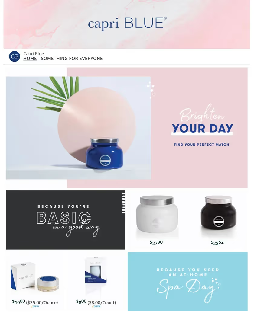
Capri Blue’s pink and blue colors and their use of minimalism makes their Amazon store feel like a relaxing day at the beach. For a spa brand, it’s a perfect tone to set. Products are displayed against clean white backdrops with limited information that could otherwise clutter the space. Capri Blue also pairs their product images with fun, personable copy that speaks to customers’ interests and keeps them curious enough to click into listings to learn more.
2. John Masters
The John Masters Organics storefront is clean and classic. Instead of displaying their products against a blank white studio backdrop, they’ve displayed them in beautiful flat lay and still life photographs with product ingredients featured prominently in the backdrop. John Masters also pairs short videos with their featured products that show how to use them and what they can do for your hair and skin. Shoppers are engaged, they’re informed, and they’re given easy access to listings through eye-catching images.

3. Bully Dog
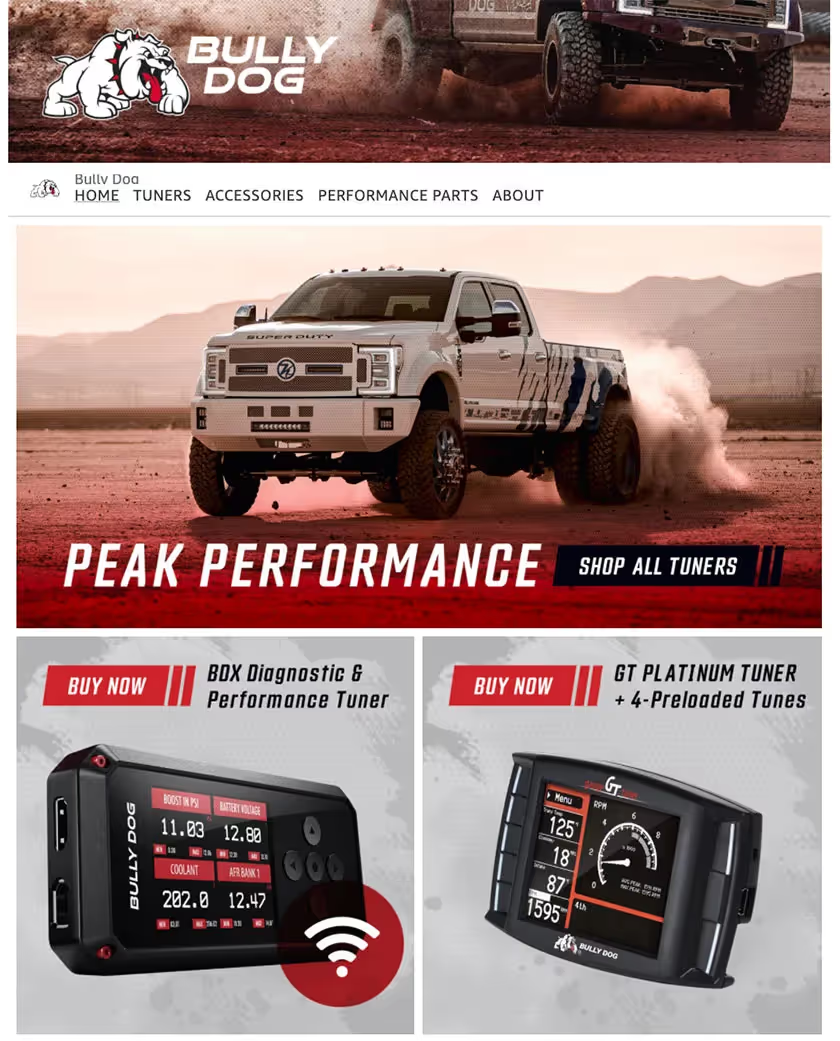
Some brands sell products that don’t photograph beautifully on their own (maybe they’re too complex or matter of fact), but they look great when they’re in action. Bully Dog, a brand that sells high-end car tuners, is one of them. The first thing you see on Bully Dog’s storefront are images of powerful trucks charging ahead with clouds of dust in their wake. Bully Dog’s use of reds and blacks as well as blocky text and imagery on their storefront reinforce the image of power. Even though you’re only seeing two samples of their products with limited info in this space, you’re getting a great feel of what those products can do for your vehicle.
4. Alpha Industries
Instead of putting their products first on their Amazon storefront, Alpha Industries puts a strong focus on their brand’s legacy. The first elements you see are a large, patriotic image linking to their About Us page and a video featuring the Alpha Industries family talking about how the brand has evolved. This approach works really well for Alpha Industries, because they’ve been an established name in the world of U.S. military apparel since 1959. Their history sells their product as much as their product itself, and they’ve capitalized on that by making it their first impression so customers know they’re dealing with a brand they can trust.

5. Mommy’s Bliss
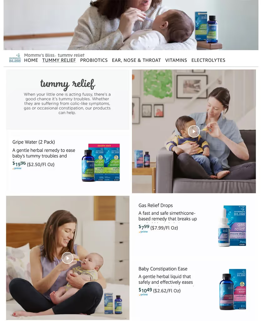
Mommy’s Bliss sells products like probiotics and herbal remedies to new moms, and their storefront listings are explicit about what each product is, what it does, and how much it costs so that their target shoppers immediately know if they’re in the right place purchasing the right product. Rather than overloading their storefront with product listings, Mommy’s Bliss pairs listings with engaging videos of moms using their products that are driven by narratives new mothers can relate to. It’s informative without being boring.
With a little help from Pattern, all of these brands were able to get their Amazon stores beautiful, sharp, and engaging. Looking for help for your own Amazon storefront? Contact us below or read about our expertise in creative services for ecommerce at one of the links below!


.jpg)







.jpg)